pfeg
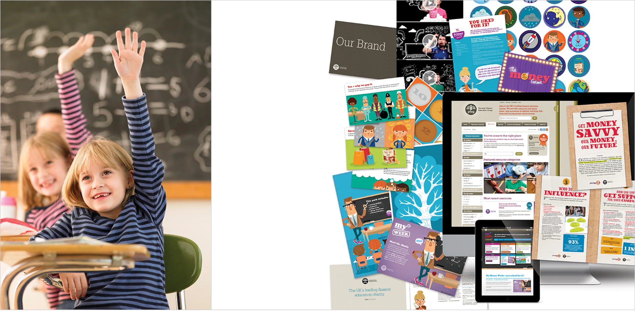
IE Brand was chosen to strengthen and broaden education charity pfeg’s impact through redesigning, consolidating and optimising their existing brand, messaging and portfolio of websites.
pfeg (Personal Finance Education Group, now part of Young Enterprise and renamed Young Money) is the UK’s leading financial education charity. pfeg and its partners work to equip children and young people with the skills, knowledge and confidence in money matters they need to thrive in today’s society.
IE Brand's work for the charity has been recognised with numerous industry awards.

pfeg was seeking an agency partner to help rationalise its online presence and to consolidate its various associated brands. Fundamentally they were doing excellent work – but their core messaging was inconsistent, and their on and off line comms needed to better reflect the quality of their work.
The core brand had to appeal to teachers, funding partners, policymakers and parents. The aim was to position pfeg as thought leaders in the educational policy arena while still retaining its appeal as an approachable, helpful charity.
IE Brand began with a rigorous period of immersion and research – including an online survey, interviews and website usage analysis – to understand the gap between how pfeg wanted to be viewed, and how they were really perceived by their audiences.


IE Brand looked at all of pfeg’s resources, sub-brands and microsites, and created the ‘family continuum’, onto which every brand could be placed to show the closeness of their relationship with the parent brand.
This brought clarity to how pfeg approached its various subsidiary brands and endorsements, and offers a guide to how closely the visual identity should be aligned with the parent brand. Brands are placed on the continuum according to whether they are sibling brands, distant cousins, or somewhere in between.
For example, a product funded by an external organisation such as HSBC needs to be heavily associated with that brand, so it’s a distant cousin of pfeg. Whereas for pfeg’s own ‘My Money Week’ campaign, which previously looked more like a distant cousin, we shifted it much closer to the parent brand.
For the core pfeg brand, IE Brand used the pfeg ‘penny’ logo, earthy colours and an intricate guilloche pattern – inspired by the patterns used to prove the authenticity of bank notes – to demonstrate the charity’s financial expertise and thought leadership.
Everything in pfeg’s communications is led by the guiding question “Does it feel authentic and grounded in the real world?” The brand uses real world textures like paper perforations, folds, hand drawn fonts and soft shadows to keep its comms tangible, reflecting pfeg’s work in the real world with real people who need real skills.
Illustration is a key ingredient of the pfeg brand. It balances the elements of the brand that ooze expertise and approachability, injecting a sense of openness, informality, youthfulness and character to everything pfeg. IE Brand created a suite of over 60 beautiful, hand-drawn illustrations with a retro feel, which set the tone across on and offline comms. They express pfeg’s playfulness and sense of humour, comfortably crossing generations.
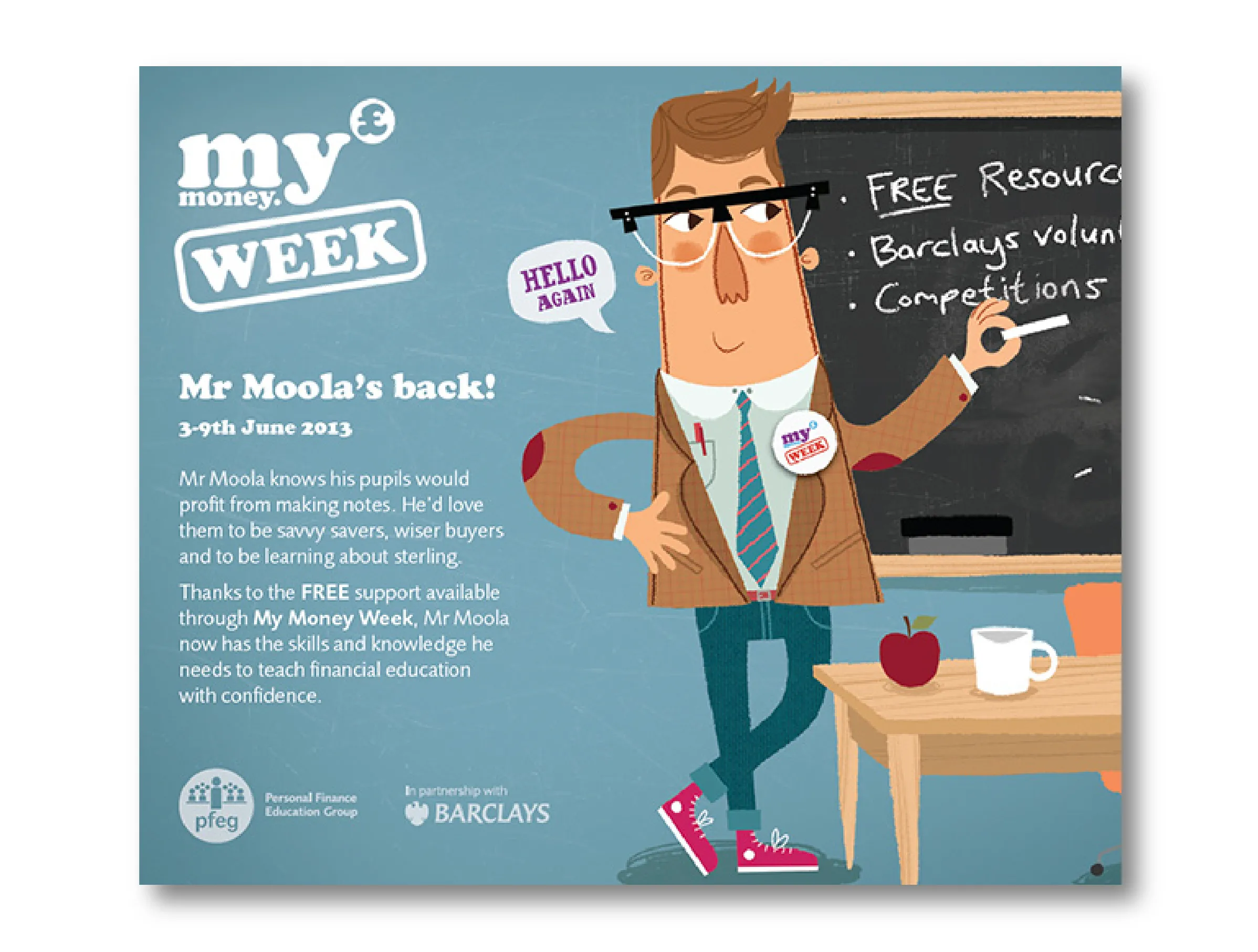
Mr Moola – one of the core character illustrations – became the face of pfeg’s successful ‘My Money Week’ – a national activity week that provides essential financial education to children as young as seven.
Wherever they sit on the family continuum, all sub-brands share pfeg’s combination of great photography and hand-drawn illustration, a consistent tone of voice and core values, and the penny logo and strapline.
To support the brand’s relaunch we also developed four introductory videos, from concept, scripting and storyboarding through to filming and post production.
Meanwhile, our digital team created an engaging and resource-rich new website (which we've since re-skinned as Young Money); providing bucket loads of inspiring materials to help teachers deliver outstanding financial education to children and young people.
Since the initial rebrand and website work, IE has continued to support pfeg with dozens of ongoing projects, from campaign collateral and educational resources to video production and digital enhancements.
For 2014’s My Money Week, pfeg asked IE to develop a suite of four short training films to inspire teachers to plan and deliver a successful week of activities. The films, ‘What is My Money Week?’, ‘This year's resources’, ‘Have you done My Money Week before?’ and ‘How to leave a legacy’, were filmed against a green screen backdrop, where we were able to place our hosts in the weird and wonderful illustrated world of pfeg’s brand.
IE Brand also designed a creative, engaging and flexible teaching resource pack for secondary schools to support pfeg’s ‘My Money Week’ initiative. The packs contained articles, problems, puzzles and a sports page in the style of a newspaper, and won Best Secondary Resource at the Education Resources Awards.
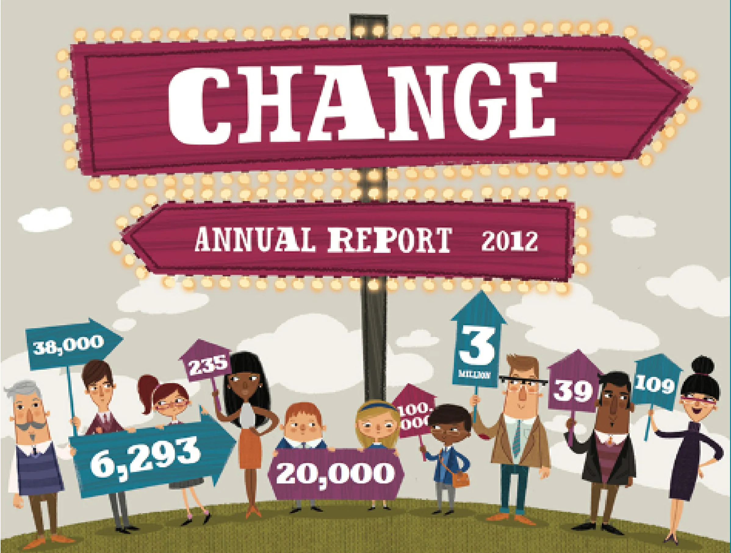
Further support over the years has included pfeg’s Annual Review, booklets and postcard mailings. We also developed various pfeg sub-brands, including the Volunteer Network and the financial education Quality Mark. That’s in addition to all manner of digital projects, from CRM integration to microsites.


