
Eikon
Client
Eikon
Services
Stakeholder engagement
Brand positioning & messaging
Campaign messaging
Visual identity & logo design
Brand guidelines & templates
Charity Marketing
Industry
Charity
Education charities
Young People Charities
Health
Mental health
Following the launch of their new 5-year strategy, Eikon wanted to review the way they communicated and promoted their work. The charity wanted their brand to better resonate with children and young people, and they also needed it to work harder to support fundraising.
Eikon is a charity helping young people in Surrey to feel safe, heard and supported. They listen, they talk, and they help young people with the skills they need to live their best life. And they work with schools and parents to make sure everyone gets the support they need.
IE Brand created a vibrant new visual identity for Eikon, including a new logo and strapline, and updated brand messaging. The new identity reflects the charity’s fun, active and engaging approach to its work, while protecting Eikon’s credibility with commissioners, schools and partner organisations.
Image
Image
Image
Step 1 - Listen
Immersion and stakeholder engagement
With their new strategy in place, and following a period of significant development and growth, Eikon asked us to create an updated brand that would better support them in achieving their charitable aims.
This was the first full brand review since the charity launched, so Eikon wanted the new visual identity to differ sufficiently from their existing brand in order to signal change.
As with any brand development project, our consultants started by immersing themselves in the Eikon brand. This was to gain a solid understanding of the history, evolution and constraints of the brand, before exploring how to reshape, rearticulate and reposition it.
As part of this work, we held an internal stakeholder workshop with the Eikon team to ask a series of ‘big questions’. This helped our brand consultants get to know Eikon inside and out, understand how the charity operates and what their key differentiators are, and learn what was working and what wasn’t.
The listening exercise included a comprehensive review of existing strategy documents and audience research gathered prior to the start of the project. IE Brand’s consultants also audited existing communications and marketing materials to gauge a baseline for how the charity has historically communicated, including what has and hasn’t worked.
Eikon's challenge
Their challenges included:
- appealing across Eikon’s key audiences (especially children and young people), while maintaining the charity’s credibility, experience and expertise
- being able to articulate the Eikon brand clearly, and explain their mission and values
- helping to simplify the complex work that Eikon does, so the charity can explain their services in a clear and effective way
- being able to fundraise more easily and increase their revenue
- encouraging staff and other audiences to feel proud to be associated with the new brand identity
Key audiences
The workshop also helped our consultants understand the key audiences we needed to reach:
- Children and young people
- Funders, fundraisers and donors
- Parents, carers and the wider Surrey community
- Schools and Multi-Academy Trusts (MATs)
- Commissioners, partners and collaborators
- Current and prospective employees and volunteers
Image
Image
Step 2 - Advise
Recommendations for the brand
IE Brand presented a set of recommendations back to Eikon, based on insights from our immersion and stakeholder engagement work. We also co-created a success criteria design brief to guide the creative process.
Putting young people front and centre
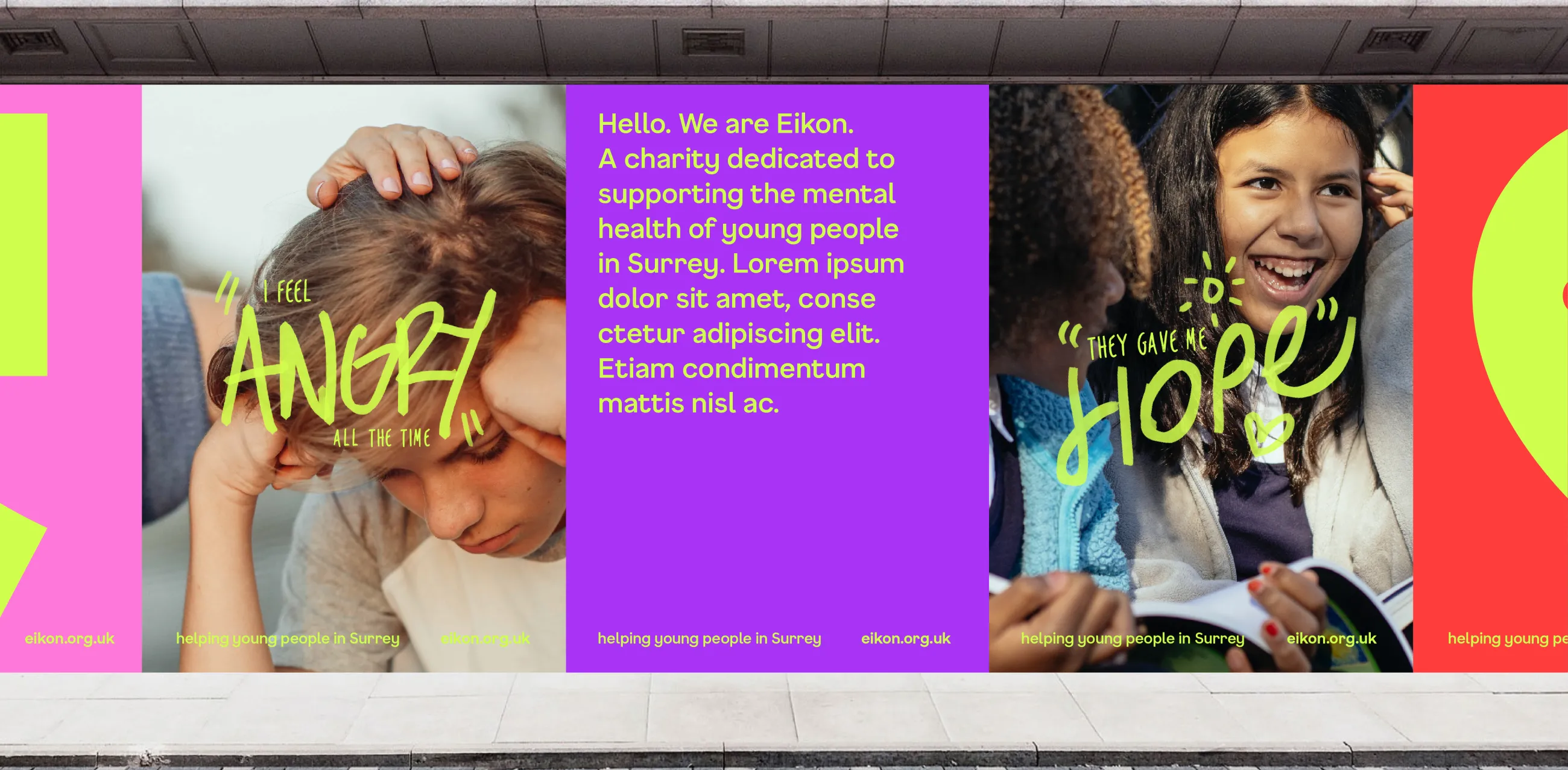
It was clear that Eikon does incredible work which is often life changing for young people and their families. The charity has a fun, active and engaging approach to their work, and they run activities that young people genuinely want to take part in. However, this wasn’t coming across in their brand.
Although Eikon’s name was well known amongst key audiences, their visual identity looked like it would appeal more to the commissioners, donors, teachers and parents who would be using the charity’s services. Eikon’s new brand needed to appeal much more strongly to their most important audience – the young people themselves – and let their voice shine through.
Brand tone of voice
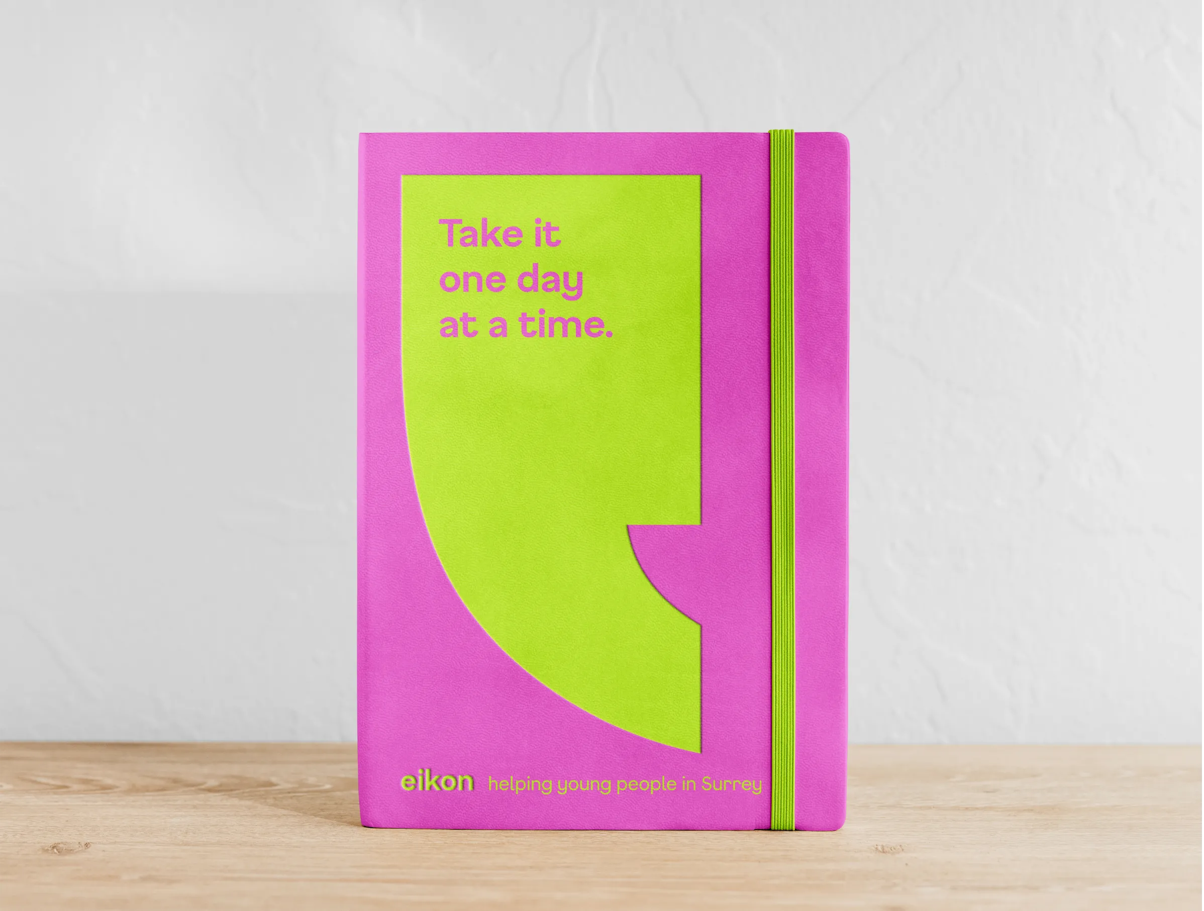
Inspired by young people, we recommended keeping the new brand tone of voice simple and to the point – losing as much jargon as possible and stripping things back to basics.
We also wanted to show that Eikon isn’t afraid to have fun. While the charity does vital work and deals with incredibly complex issues, it doesn’t mean they need to have a downbeat brand. Young people love their sessions with Eikon – whether it's one to one support, group activities, gardening clubs or hanging out with friends over video games – because it makes them feel good. So it was really important that the updated brand made people feel happy and hopeful.
New strapline
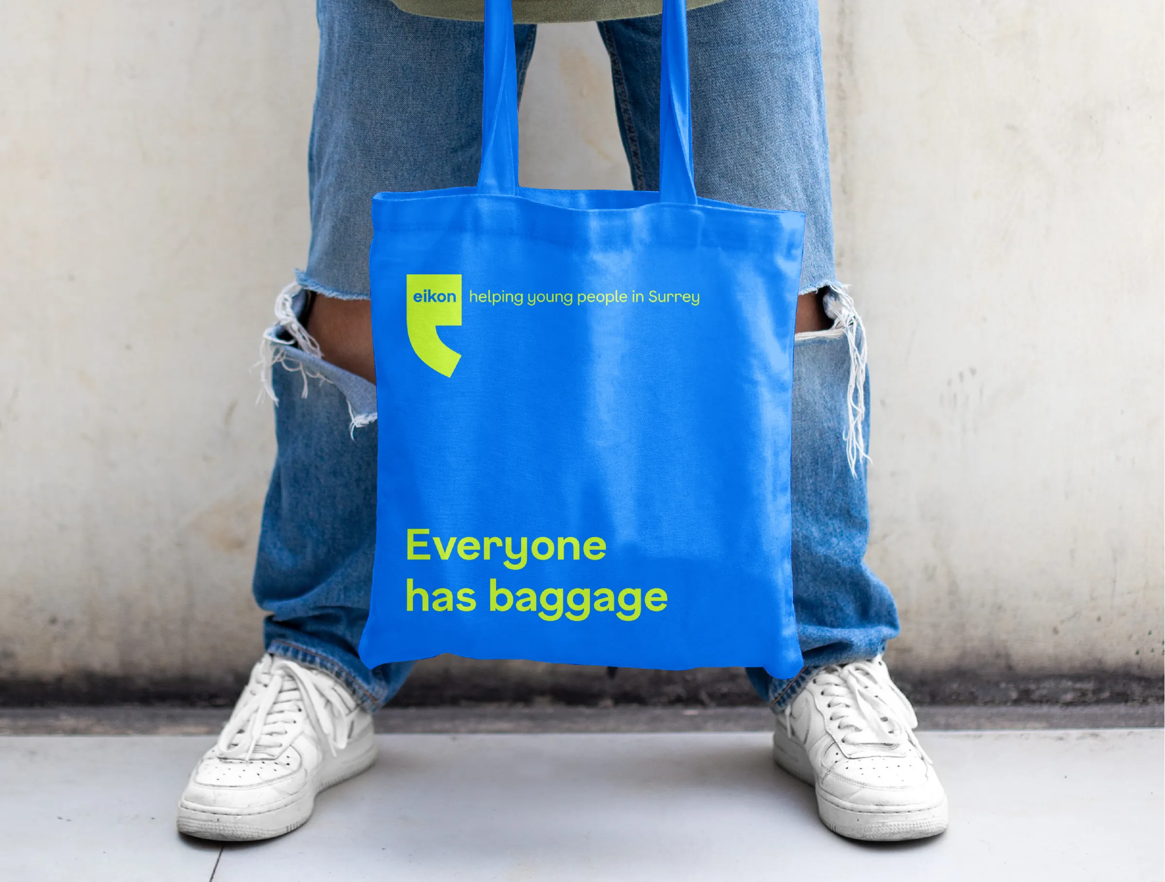
We recommended a simplified strapline which would help give the Eikon logo and name greater meaning: ‘Helping young people in Surrey’. The new strapline clearly communicates what Eikon does, who they do it for, and where they do it.
There are many ways in which Eikon supports young people, and the charity offers multiple services. But the one thing every young person has in common is that they all need help.
Image
Video file
Video file
Step 3 - Deliver
Creating the new brand
Following our advice and recommendations, IE’s brand designers worked to create a vibrant and distinctive new visual identity for Eikon, in line with the agreed success criteria.
Brand messaging
IE Brand’s copywriters crafted the Eikon story to describe the brand’s ethos and personality.
We kept the brand messaging simple and to the point, avoiding buzzwords that would put young people off. The tone is conversational and authentically youthful, while bearing in mind Eikon’s brand personality: caring, welcoming, knowledgeable, generous, determined, responsive and ambitious.
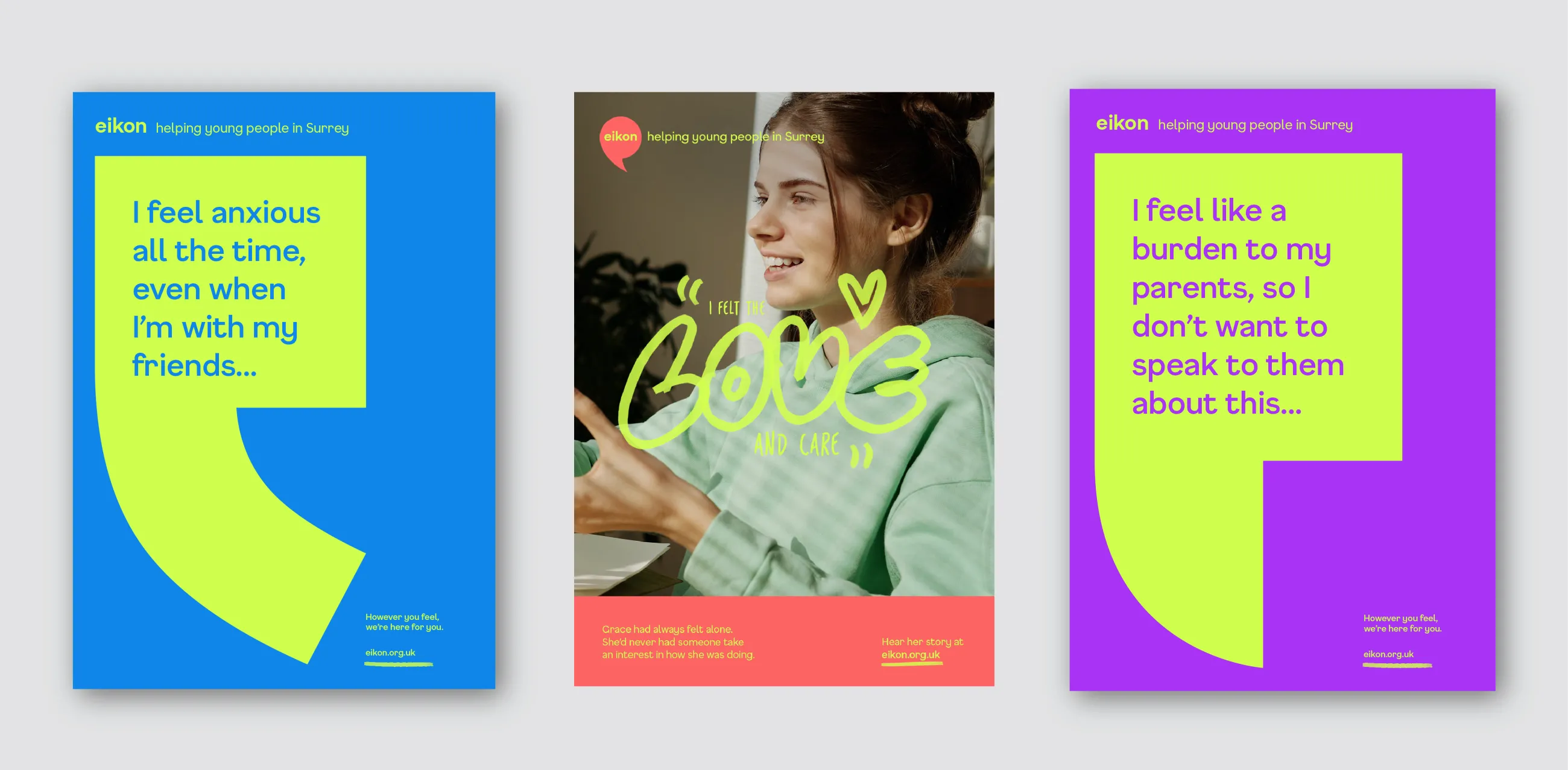
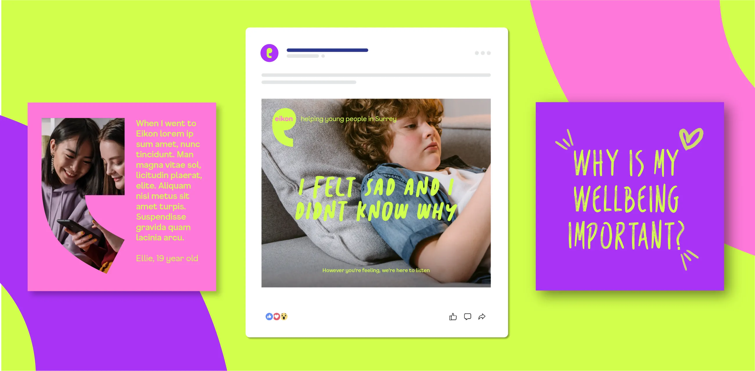
We wanted to build a brand informed by those that Eikon helps directly – the young people themselves. The campaign messages are based on snippets of dialogue from case studies and testimonials, authentically communicating what young people want from Eikon, such as:
- I want someone to listen to me
- I want to understand why I feel the way I do
- I want to make my problems go away
- I want to help my friends who are struggling
- I want to do things I enjoy
Eikon also needed to be able to tailor its communications for additional audiences, including funders and donors, parents and carers, schools, commissioners, and employees and volunteers.
IE Brand’s copywriters created a messaging matrix outlining the drivers for each audience, their specific calls to action, along with brand and campaign messaging. The matrix is a practical one-page tool for the Eikon team to use. It ensures the right messages for the right audience, whether the team are seeking funding, building partnerships in their local community, or recruiting new staff or volunteers.
Visual identity and logo design
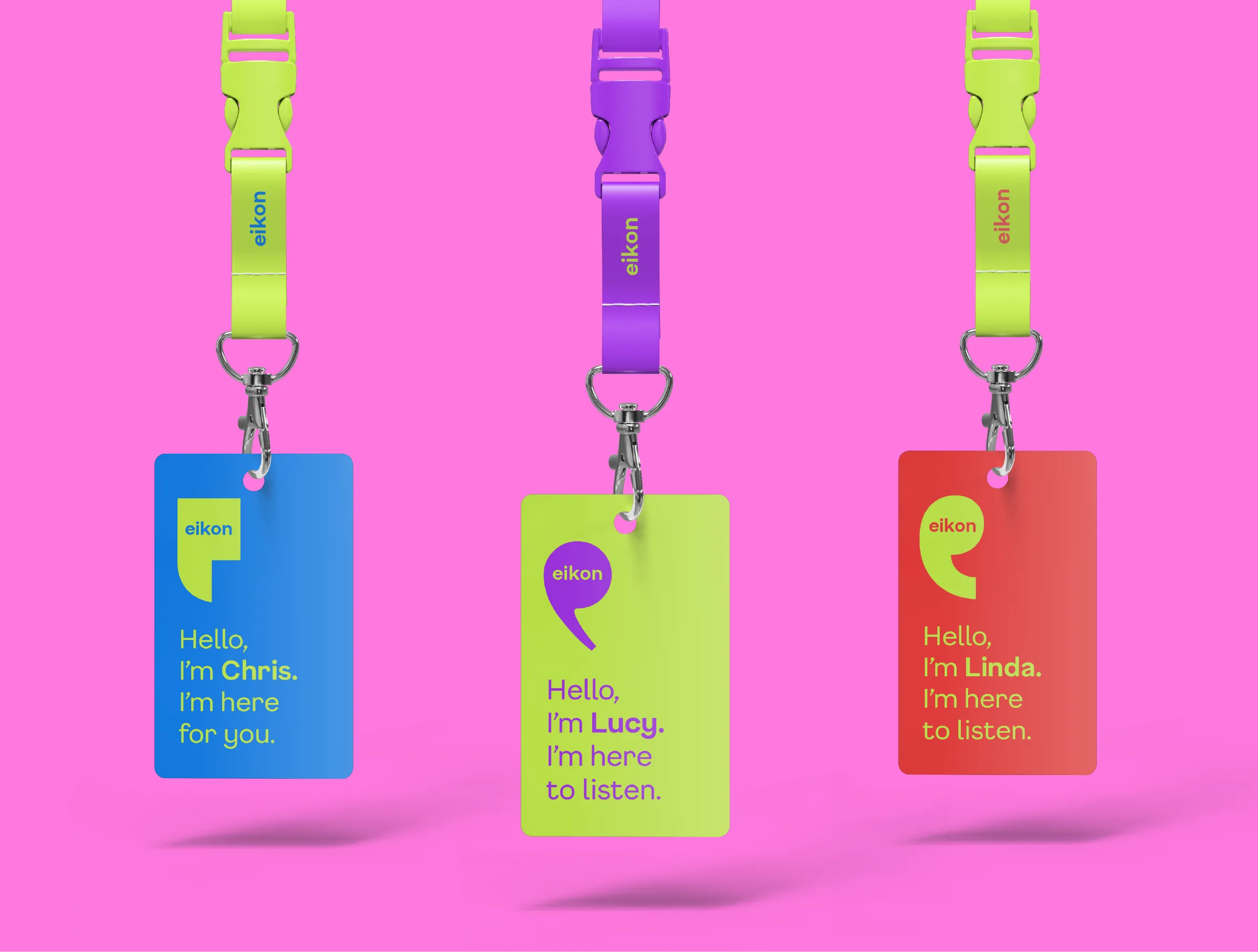
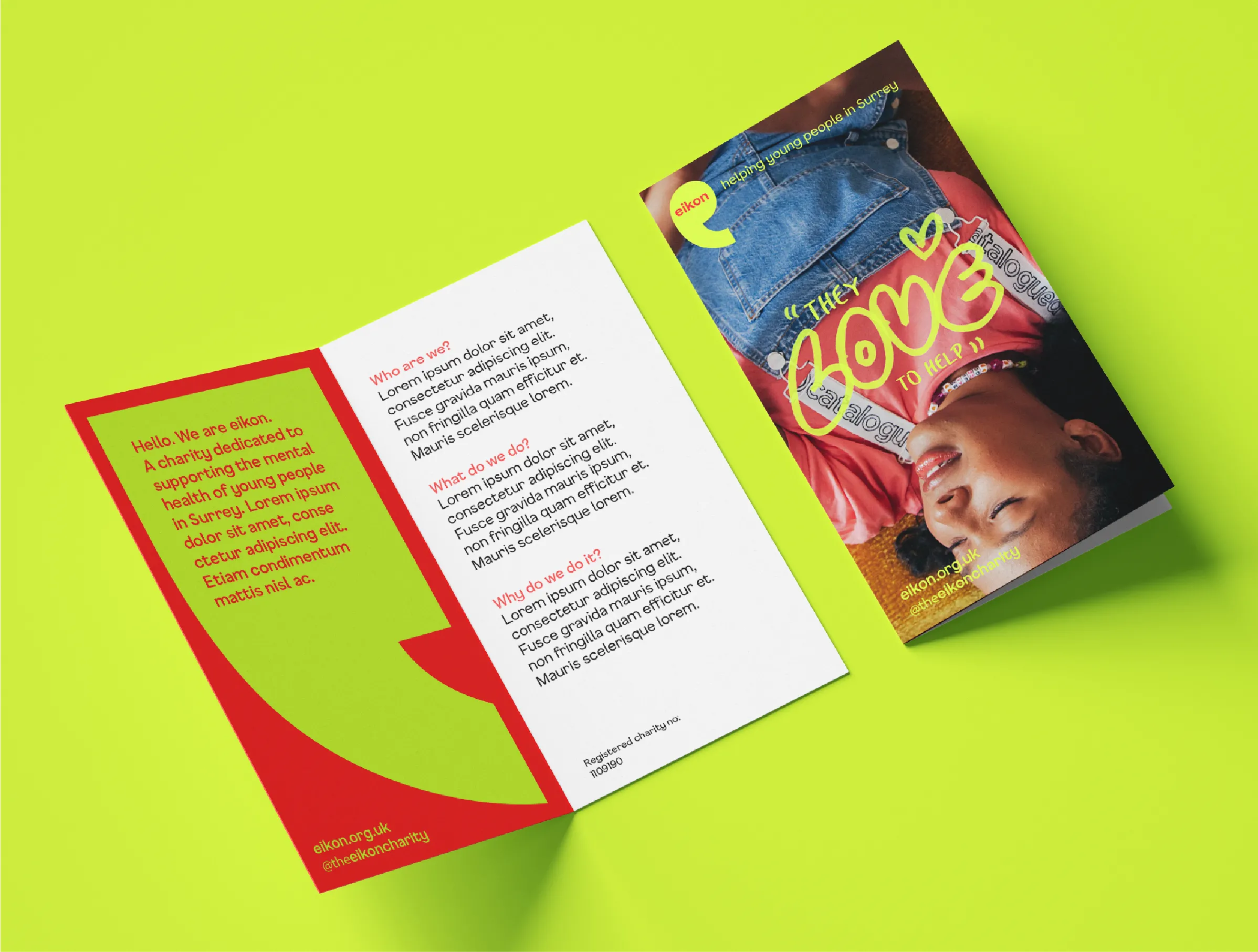
Eikon wanted to create a vibrant new visual identity that better resonated with children and young people. They create a safe space where children and young people can speak out – or to be silent if they need to. This idea of listening to the voices of young people is absolutely central to the brand, so this core brand idea is woven throughout the visual identity and messaging.
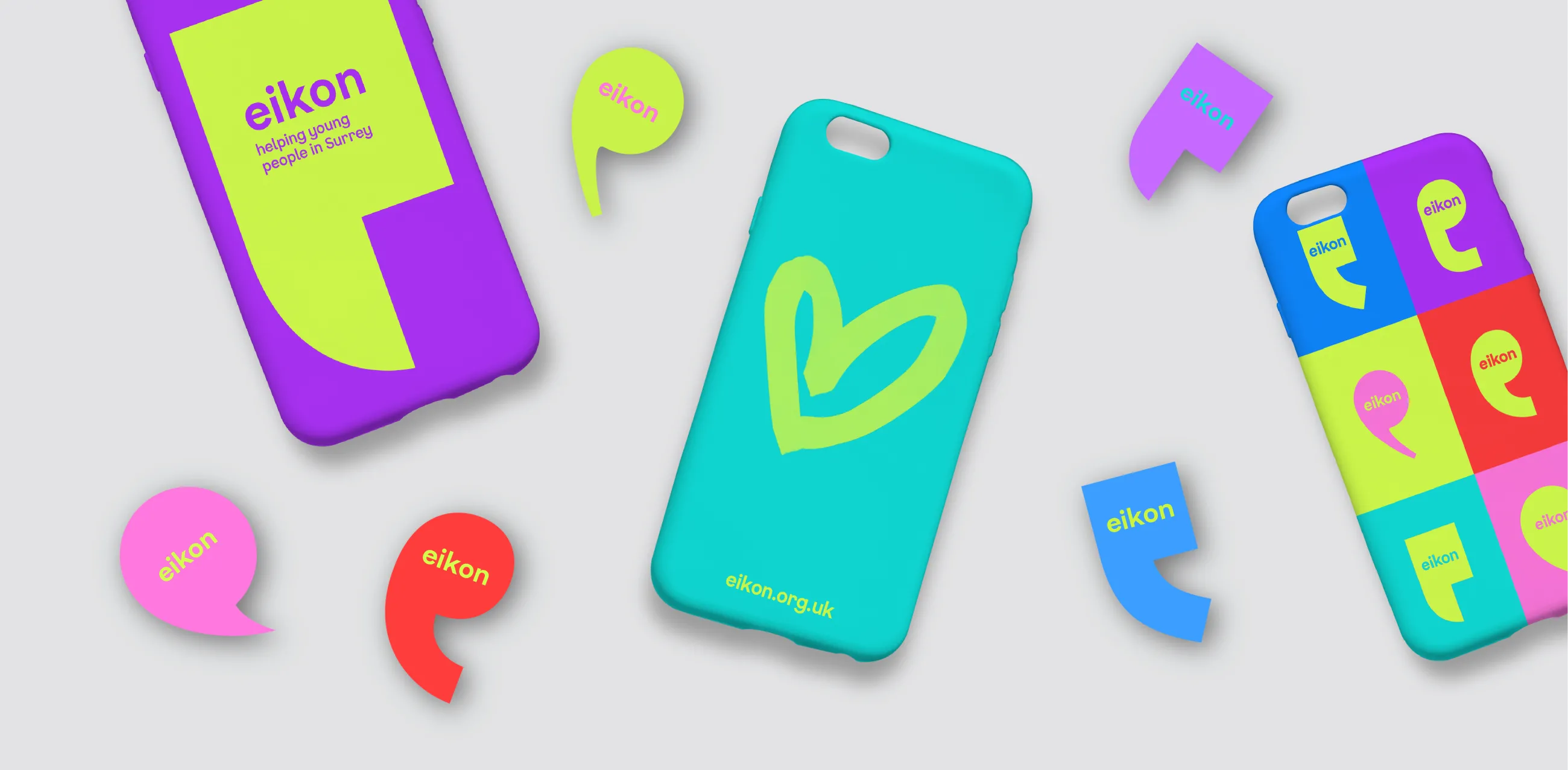
We created a logo icon based around not just one speech mark but six, to show how Eikon celebrates the diversity of young people's voices. In total we created 60 versions of the logo icon, by combining the full, colour palette of six 'highlighter pen' shades. These combine with two handwritten-style typefaces and some hand-drawn doodles to bring the look of study notes or a journal.
The speech marks can also be used as containment devices to house other design elements, such as typography or reportage-style photography to create interesting and impactful design compositions.
Image
Image
Image
Step 4 - Support
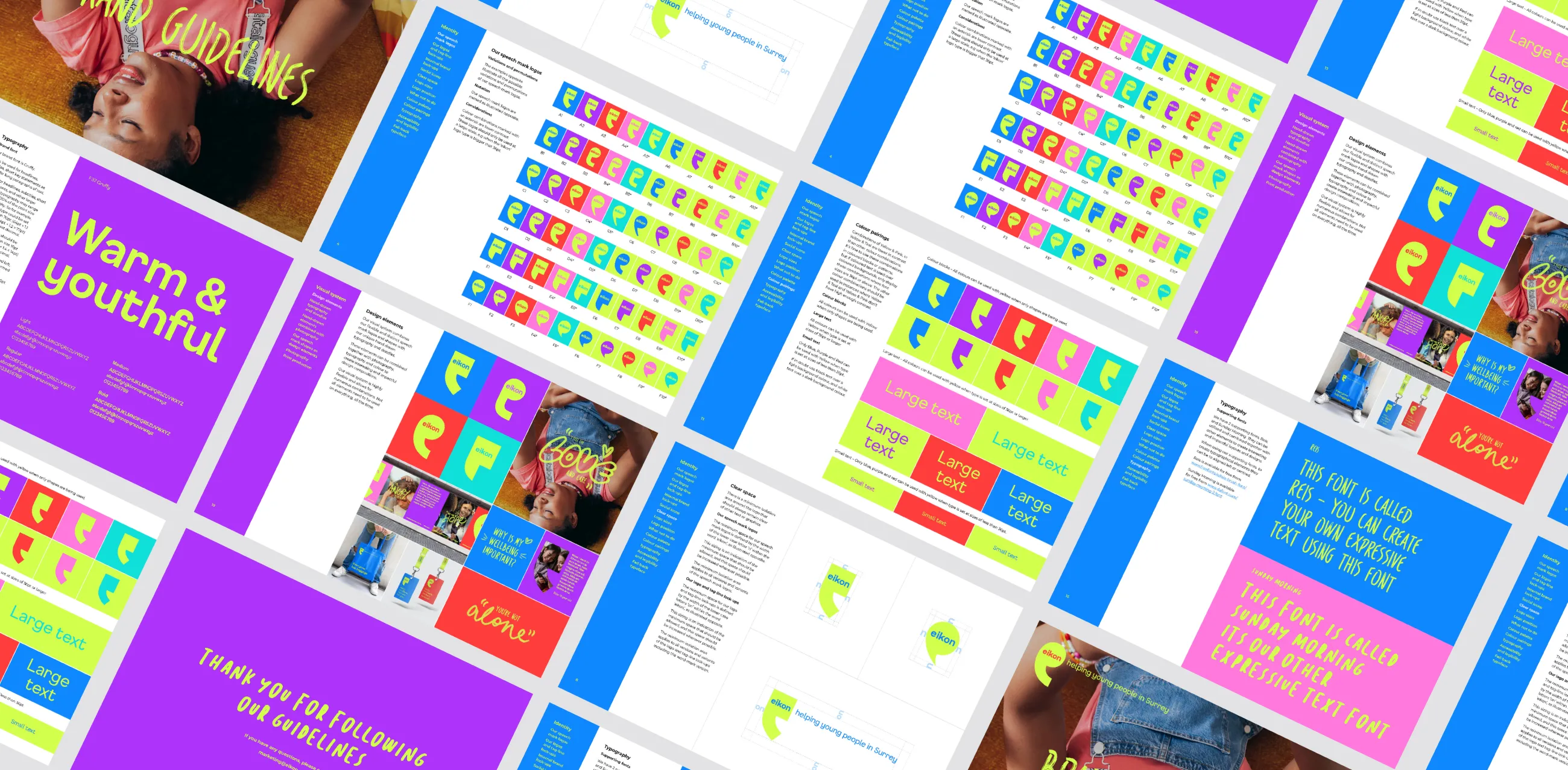
Brand guidelines and templates
IE Brand formalised Eikon’s new visual identity with a set of brand guidelines. These will enable the charity, and any external suppliers they work with, to create engaging branded communications that are cohesive and consistent.
The guidelines also demonstrate how Eikon’s visual identity can work alongside partner branding, such as Mindworks Surrey.
Additionally, the IE Brand team also created a package of on-brand templates to ensure consistent roll-out to a wide range of branded communications. Templates ranged from letterheads, email signatures and PowerPoint presentations, to email newsletters, donor email templates and posters.
Once the new visual identity was in place, IE Brand worked with Eikon’s incumbent digital agency to reskin the charity’s website and ensure the new brand was rolled out consistently.
1 in 6 children (and rising) had ‘a probable mental health disorder’ since the pandemic
17,085 individual attendances at group and one to one sessions
95.45% said "Eikon gave me the support I needed at the right time