Resuscitation Council UK
Following a brand review and extensive stakeholder research, it was clear that Resuscitation Council UK required a top-level rebrand to reposition the charity for a wider audience, to be rolled out on and offline.
Resuscitation Council UK is working towards a day when everyone in society has the skills they need to save a life. The charity achieves this goal by delivering training (its primary source of funding), developing guidelines, influencing policy, and supporting cutting-edge scientific research.
Following the rebrand, Resuscitation Council UK now exudes energy and a passion for saving lives. The charity is more down-to-earth and accessible to a range of audiences, without ever compromising their long-standing reputation among clinical and healthcare professionals for their unrivalled expertise.


Resuscitation Council UK wanted to move beyond its established clinical roots to become a more public-facing brand.
The charity had been going from strength to strength, with record-breaking numbers of people learning life-saving skills as a result of their campaigns. But they had broader ambitions to increase public awareness of cardiac arrest and to improve survival rates by educating the public on what to do in an emergency.
Resus recognised that their messaging lacked clarity and cut-through, and their visual identity was neither distinctive nor applied consistently. Meanwhile, popular campaigns like Lifesaver were too detached from the parent brand.
Qualitative and quantitative stakeholder research
Just as Resuscitation Council UK is committed to clinical excellence in its lifesaving guidance, any changes made to its brand had to be based in a strong body of evidence. Alongside some broader quantitative research to inform their strategy, the charity was keen to explore external awareness and public perception of its brand.
IE Brand’s researchers conducted an extensive programme of stakeholder research, focused on the charity’s name, branding, website and existing marketing activity:
- Internal Stakeholder Workshop
- Qualitative research through workshops and one-to-one telephone interviews: 55 participants including staff, instructors, the executive team and sub-committee members, and influencers in the health sector
- Naming Workshop to explore whether a rename would be beneficial
- 3,664 respondents to a quantitative e-survey
- 51 street interviews with the public to explore brand awareness and perceptions among their key audiences.
Our research confirmed that Resuscitation Council UK’s reputation was strong among its core audiences of healthcare professionals and first aid organisations, who saw them as authoritative, expert, informative and knowledgeable. However, the public – who play a critical role in improving lifesaving outcomes – had barely heard of them, and their existing logo (a heart with an electrical lightning bolt running through it), was triggering misplaced anxiety about the risk of harming people by operating a defibrillator incorrectly.
The next step was to reposition the brand in a way that would retain Resuscitation Council UK’s deserved reputation for academic rigour and clinical excellence while presenting a friendlier, more accessible face to the general public in order to encourage them to gain important lifesaving skills.
For Resus to become the go-to provider for resuscitation training in the UK, they needed to step outside their comfort zone and become bolder and braver. Research showed the brand was often seen as formal and distant, even officious. Resus needed to be warmer, easier to talk to, and to differentiate their marketing and comms messaging from their more clinical academic publications.
The new brand needed the flexibility to adapt for different audiences, from course instructors and healthcare professionals, through to influencers like the Government, trusts, the media, and ultimately course attendees and the public.
We also advised against creating any further sub-brands, which were in danger of diluting the parent brand further.
Putting the WHY before the HOW
The old Resus value proposition, “… to promote high-quality, scientific resuscitation guidelines that are applicable to everybody, and to contribute to saving life through education, training, research and collaboration.” lacked impact. We brought “Saving lives” to the fore across all comms.
Saving lives provides the WHY, before explaining the HOW. But it was also important to strike the right balance between saving lives and the complexities around ReSPECT – Recommended Summary Plan for Emergency Care and Treatment – which empowers people to make personal decisions about whether they wish to receive life-sustaining treatments, based on their circumstances.
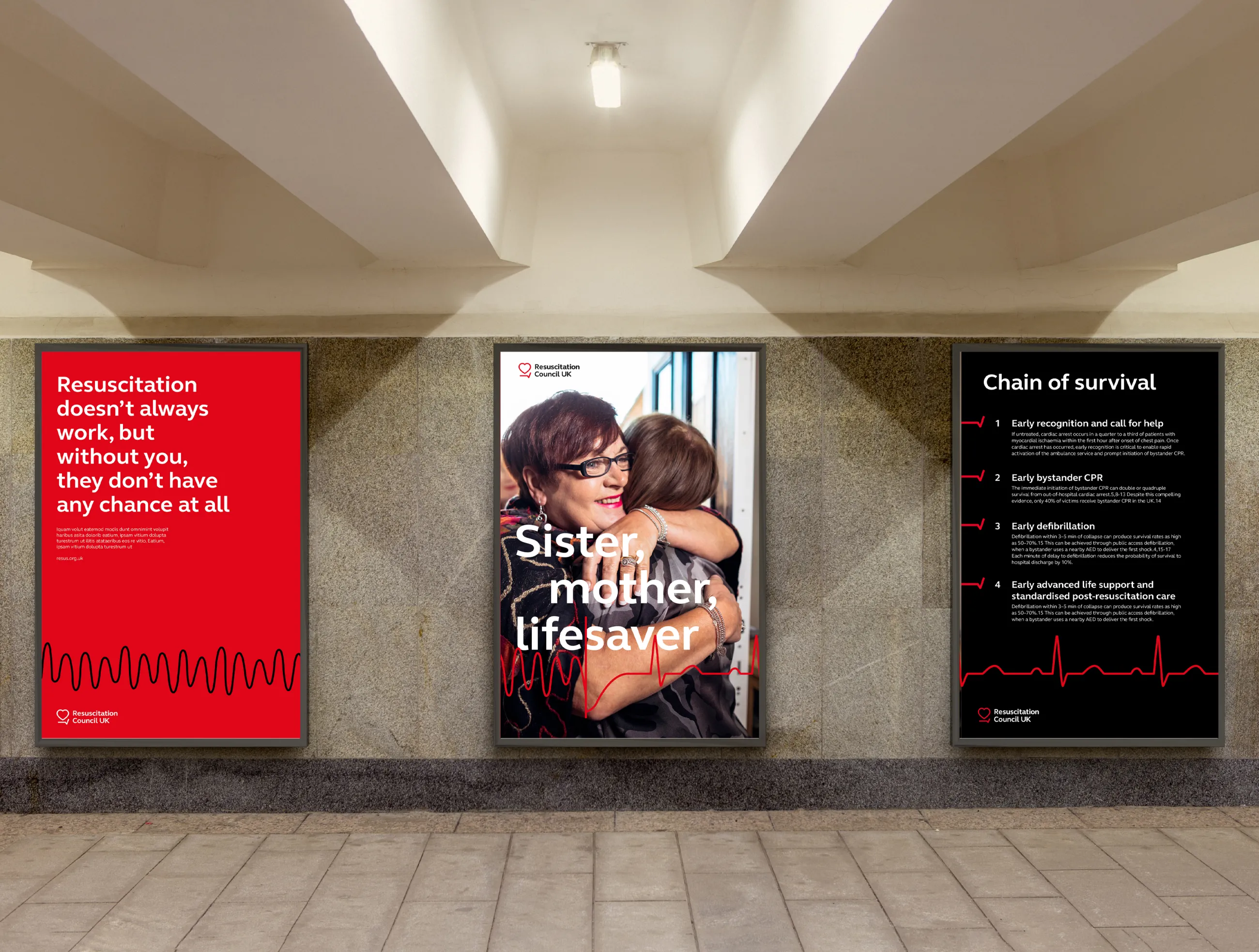
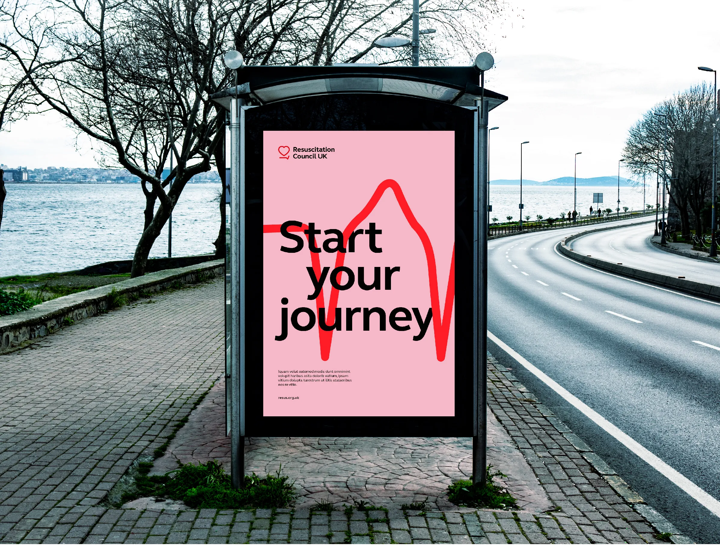
The brand’s new tone of voice, messaging and visual identity are carefully crafted to reflect the charity’s personality as Passionate, Accessible and Expert. They enable Resuscitation Council UK to adopt a louder voice on the national stage.
A comprehensive messaging matrix details Resus’s new tone of voice, and the key messages and calls to action for each audience, whether it’s letting health professionals know that it’s time to refresh their training, influencing government policy, or tackling public fears around the risk of doing more harm than good.
Evidence-led and human
We adopted hard-hitting messaging that show the world how much work there is still to be done. This, combined with arresting statistics, reflects an evidence-led approach, complemented by real stories of human impact.
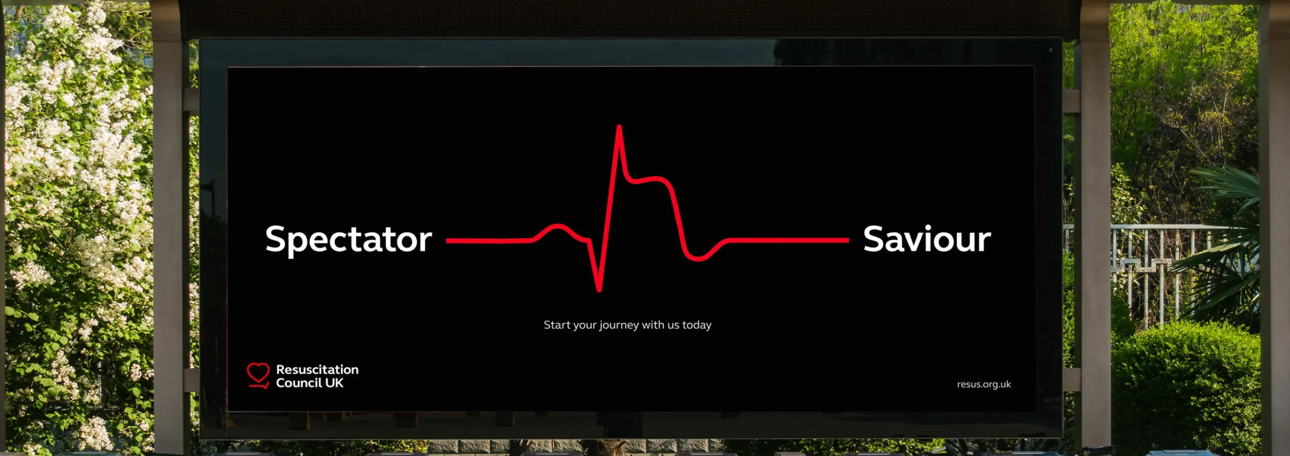
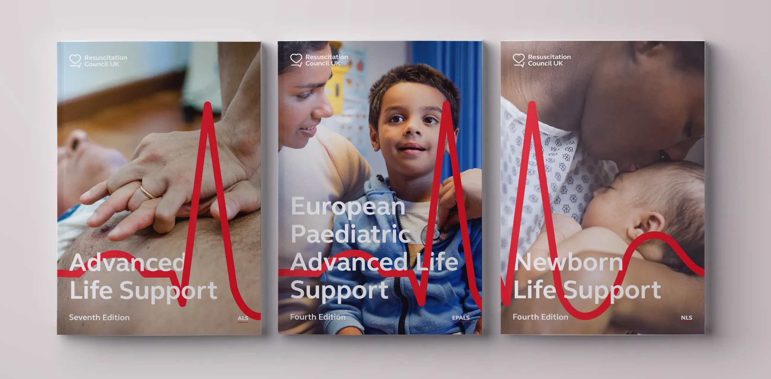
A series of clinically accurate ECG patterns stands at the heart of Resuscitation Council UK’s new visual identity. These represent everything from normal heart rhythms, through to abnormal variations that contribute to Sudden Cardiac Arrest, and the use of a defibrillator.
An evocative new logo marque
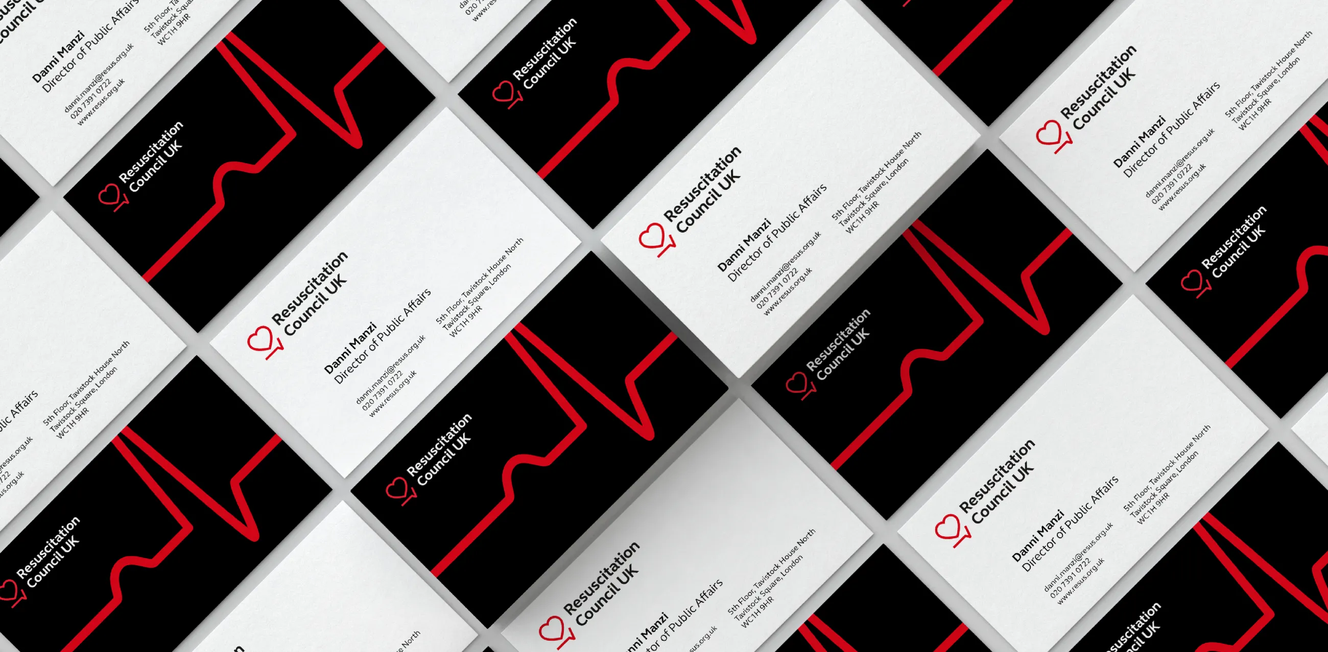
This theme runs through into the new logo/marque for the brand, which is based around a heart and line motif and a clear, elegant, and modern typeface. As well as the suggestion of an ECG, representing Resuscitation Council UK’s mission to save lives, the line can be variously interpreted as a platform for their inspirational thought leadership, reflecting rigorous standards (a ruler and tick), or representing ReSPECT (a flat line ending in a tick).
Most importantly, the logo is distinctive and intriguing – instantly recognisable on and offline.
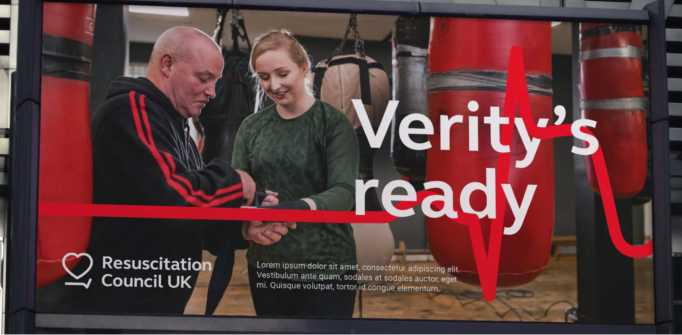
For continuity, we retained the classic red, black, and white of the old identity, with their strong associations with the heart – and added pink to visually soften the brand when necessary. A new, ‘reportage’ style of photography completes the visual identity, giving the brand a friendlier, more ‘human’ face.
The new visual identity is now more approachable and inviting. It can switch effortlessly between being clinician-facing, for formal documents like reports and manuals, to being public-facing for a national life saving campaign.
The project won Bronze for 'Best Visual Identity from Healthcare and Pharmaceuticals' at the Transform Awards Europe 2021.
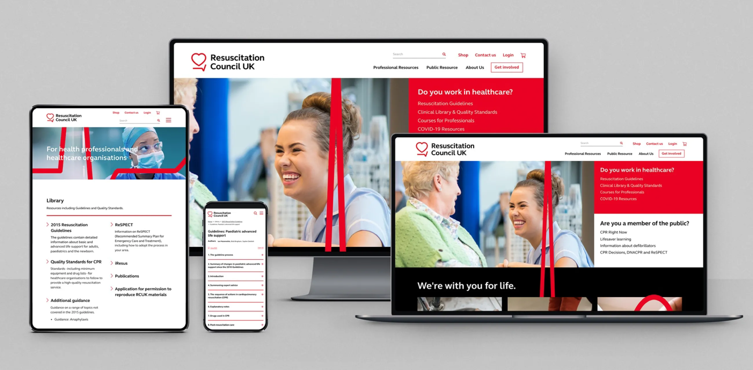
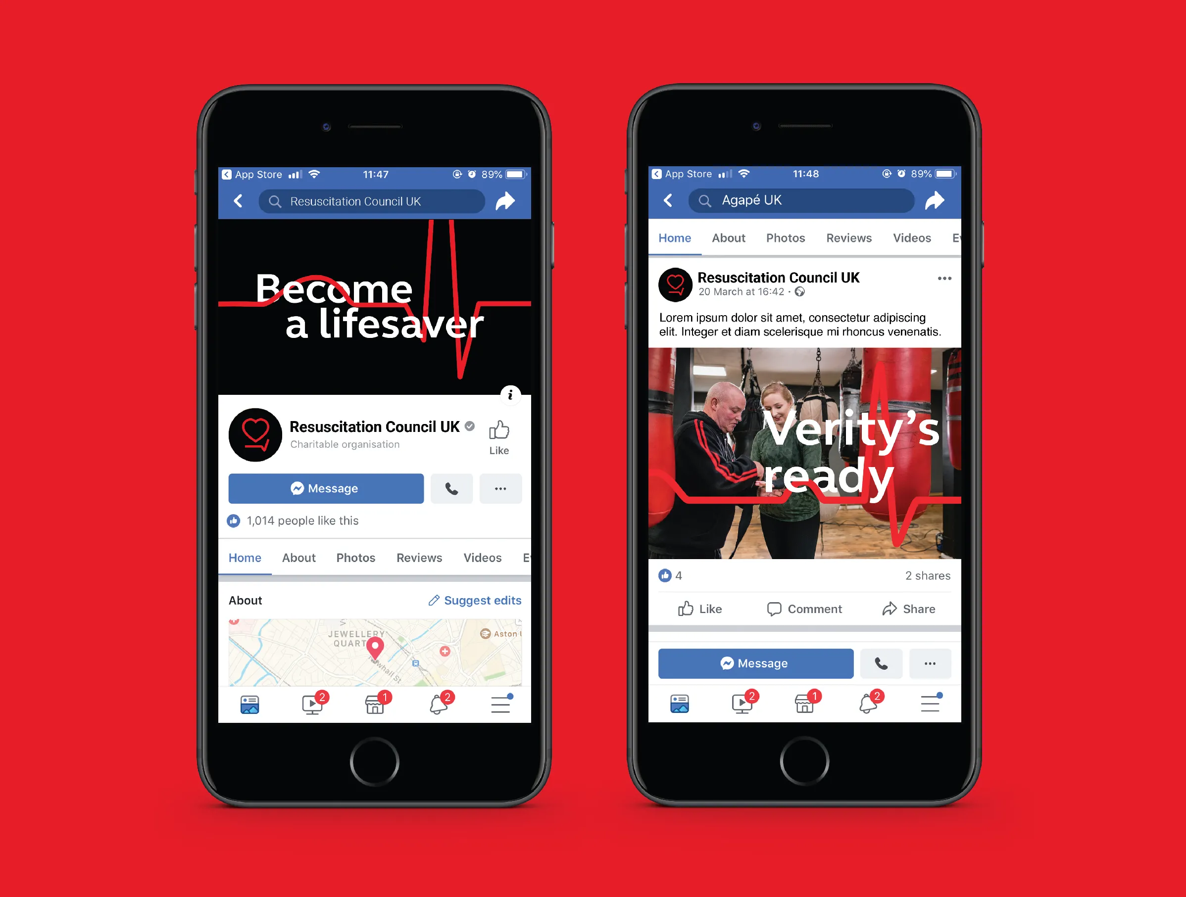
The new messaging matrix, detailed brand guidelines and branded templates enable the Resus marketing team to create the full range of on and off-line comms that they need, such as the animated CPR video below.
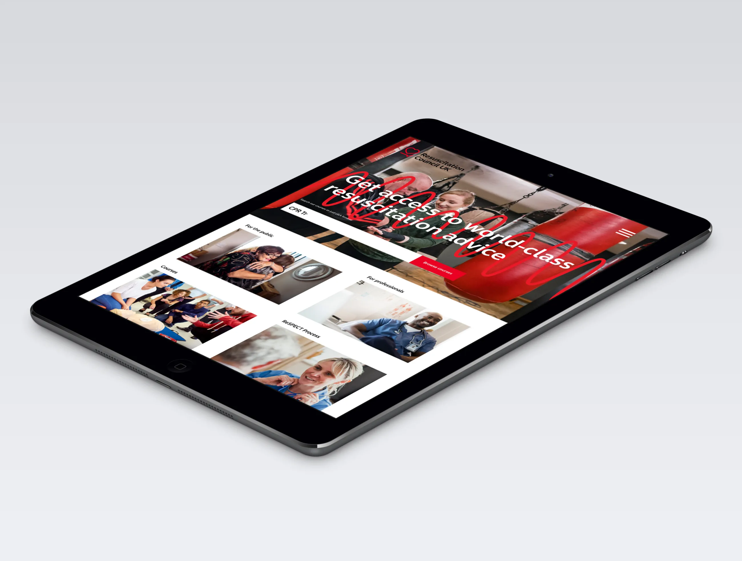
This is complemented by an informative new Drupal website. Despite containing a wealth of valuable content, research showed that the old site was difficult to navigate. A thorough content audit, a more intuitive information architecture and the creation of a Frequently Asked Questions section have all substantially improved the user experience. Whether you’re a health care professional or a member of the public, the information you’re looking for is now far more accessible. Read the full case study on how we designed and built the new Resuscitation Council UK website.
We'll continue to support Resuscitation Council UK as they roll out their new brand across key collateral like their flagship five-year resuscitation manual, and we’ll repeat the initial research after 18 months to review perceptions of the brand.


