Ceradas

Ceradas is a leading board effectiveness consultancy, working with quoted public company boards and private companies as they move through different stages of growth.


“IE Brand has really brought Ceradas to life with a great new brand and website. Through an iterative process of moodboarding and feedback, the IE Brand team quickly arrived at a creative direction that encapsulated my vision for the business. I’ve been delighted by the result, which captures just the right balance of professionalism, pragmatism and empathy.”
Chris Stamp
Director, Ceradas
Before we landed
The founder of Ceradas, Chris Stamp, had been operating as an independent business consultant for a couple of years, but without any brand or website. He came to IE looking to professionalise his offering and create a visual identity to represent the business and take Ceradas forward.
The challenge we were set
Ceradas needed a stylish new visual identity to convey Chris’ personality and the overarching brand tone of voice: pragmatic, conscientious support from experts with integrity, empathy, understanding and a wealth of experience.
The difference we made
- A highly collaborative design process to bring the brand to life with a new visual identity.
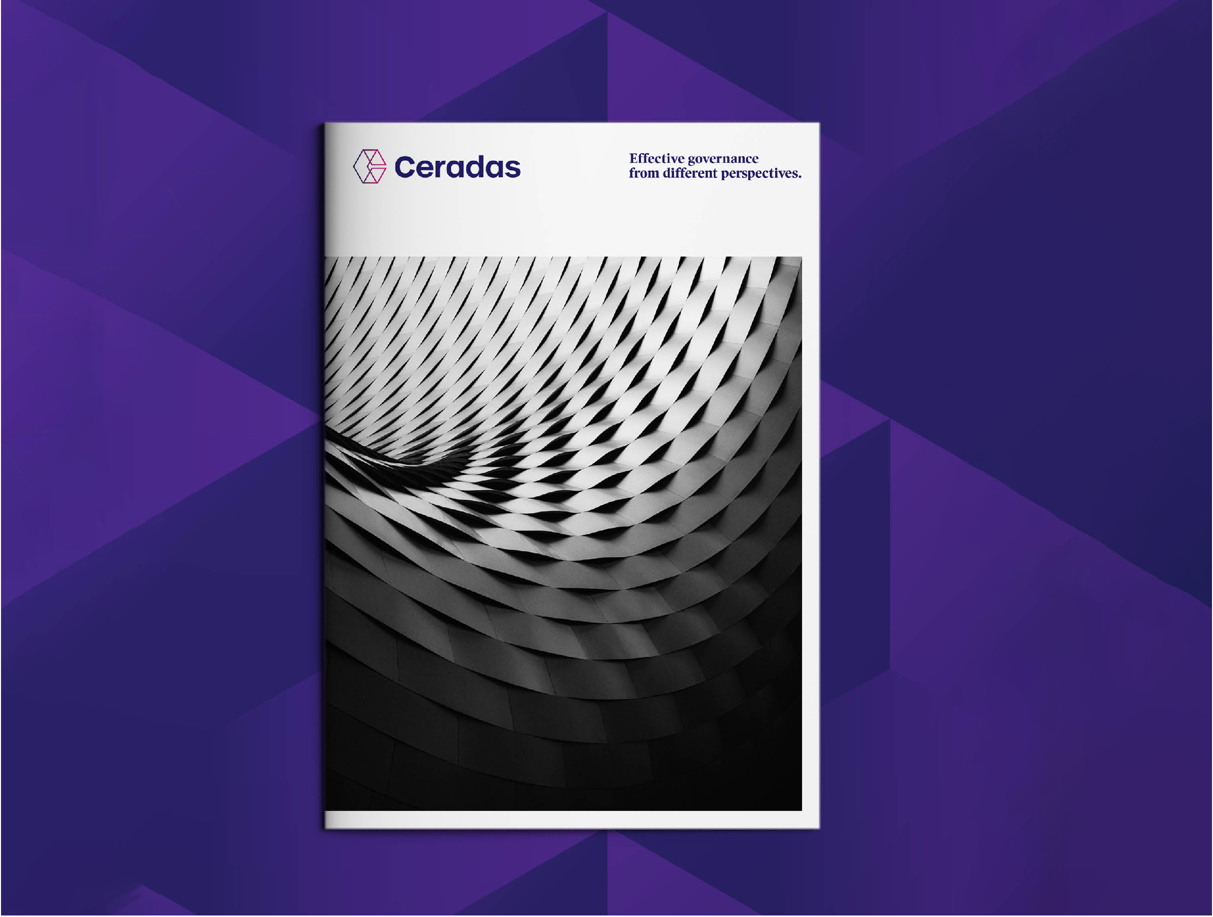
- Inspiration from modern architecture, patterns and shapes, representing the different perspectives and views needed to understand today’s business challenges.
- A review of the competitor landscape, creating a colour wheel of over 75 consultancy logos to arrive at our distinctive colour palette in vibrant hues of fuchsia and indigo.
- A bank of visual assets – architectural shots, plus shots of business people in conversation to ground the brand in the real world.
- A simple, brochure-style website, featuring a slick user interface design and stylish transitions for a high quality feel.
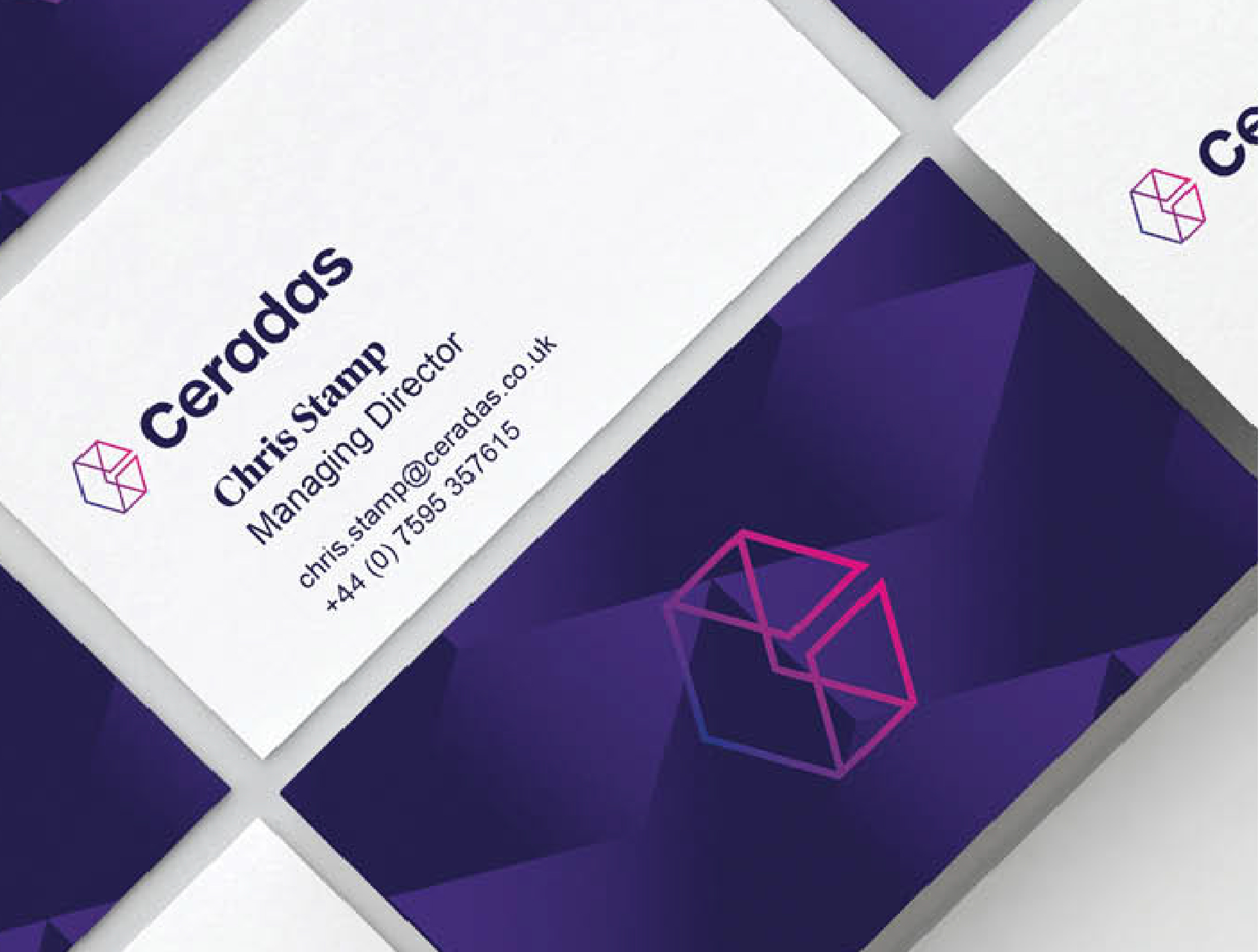
- Business cards, LinkedIn assets and brand guidelines.


