
Health, Other
A new name, rebrand and website for Herefordshire Cares
Herefordshire Council asked IE to rename and rebrand their campaign brand to recruit more people into the adult care sector. We positioned the brand to connect better with its audiences, giving it a vibrant visual identity, a new logo and a user-friendly new WordPress website.

Herefordshire Cares is a campaign from Herefordshire Council. It aims to raise the profile of those working in the adult care sector and show candidates that it's a versatile and rewarding career path.
The council wanted to give the brand a new lease of life. They wanted to offer the target audience more tailored insights and information about careers in adult social care. That means not just entry-level care workers but also team leaders, activities coordinators, office work, and managerial positions. They needed to show that jobs in the sector are both rewarding and achievable – ultimately to recruit more people into the industry.
IE Brand & Digital was tasked with renaming, rebranding and realigning the campaign with its updated core values. It was also important to address the campaign’s digital presence.
Understanding our audience
For the campaign to work, we needed to celebrate carers, while making it clear to people that the brand was for them.
Our brand research with stakeholders revealed the 5 most valued factors for people working in care:
- The feeling that you’ve made a difference
- Being valued, thanked and supported
- Nice people to work with
- Work-Life balance
- Career progression; training and job opportunities
We also explored where people were looking for roles, and what wasn’t working with the existing brand name. Getting this right was important to the success of the project and winning buy-in from the internal teams.
Renaming the campaign brand
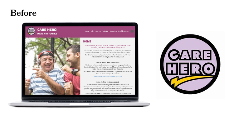
The old name, ‘Herefordshire Care Heroes’, wasn’t working. People almost never think of themselves as a hero, heroes are other people. So the brand was failing to connect with its target audience.
Keeping the new name simple was important, which is how we landed on ‘Herefordshire Cares’. It’s a simple brand name, including enough information to make it clear what the campaign is about and the communities it is for. It encapsulates a strong sense of community and sits well alongside Herefordshire Council’s other campaign brands, such as Talk Community.
Alongside the new name, IE Brand created simple brand messaging for the campaign. We focused on the different reasons why a person may need a carer. That might be to regain their independence, or to have someone they can depend on.
We had slightly different campaign messaging for different audiences, such as people who might return to a role in care after a break. The messaging is all designed to provoke an emotive response in the audience.
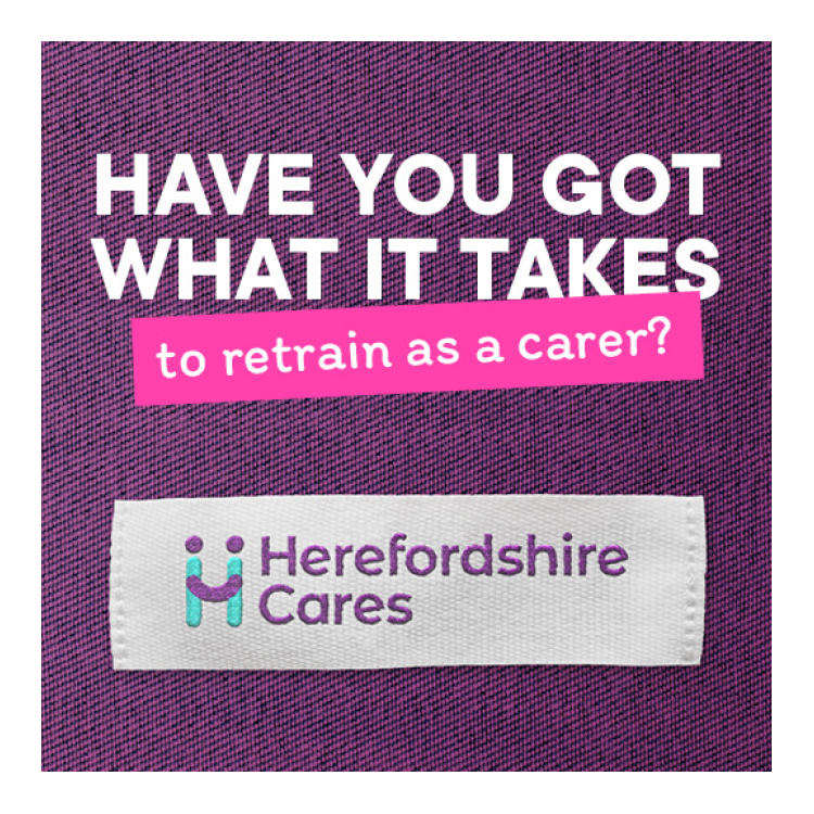
Visual identity inspired by care
The new Herefordshire Cares visual identity takes its inspiration from carer uniforms. The logo features on a label graphic, which is used as a key element in both print and digital comms. This gives their comms a textural warmth and human element.
Campaign comms feature a simple, direct statement, followed by an informational ‘sticky label’ that provides more information. The graphical elements in a vibrant colour palette of turquoise, purple, pink and yellow sit alongside authentic portrait photography.
New recruitment website
Moving into the website project, we knew that there were some fundamental changes needed.
The old site was hard to navigate and lacked a clear user flow and journey. It was important to make things as accessible as possible, and make it easy for people to find the information that’s relevant to them.
Herefordshire Cares needed a new website to make the transition from Care Heroes and move the campaign forward. It had to really sing the brand’s core values and champion the aims of the campaign.
Intuitive user journey
IE Digital focused its consultancy on designing a clear and intuitive user journey. The site’s primary role is to offer advice and information about a career in care.
The content focuses on why Herefordshire Cares exists, and the difference that careers in care can offer – both to the people receiving care, and those who provide it. The site uses case studies of real people who have chosen a career in care and allows them to tell their stories. There’s also advice on how to start a career in care or pick it back up after a break.
The new website also features a jobs board and filter to promote the range of care opportunities available across the county.
The team at Herefordshire Council have complete access to the WordPress CMS, allowing them to edit content and build new pages as needed.
A campaign to make a difference
It was such a pleasure to work on the new Herefordshire Cares brand and website with the Herefordshire Council team. We’ve already had some really great feedback and we can’t wait to see the difference the campaign will make to the Herefordshire care community.