Charity
A new name and brand for charity Serving in Mission
IE Brand helped SIM UK to rename as Serving in Mission, giving an old acronym new relevance. We brought the charity brand to life through new brand messaging, logo and visual identity, and a Drupal website and digital strategy.

I wanted to take a look back at our rebrand of SIM UK, who we renamed to Serving in Mission in 2012. It's a project I still look back on fondly – and with pride.
Serving in Mission is an international, interdenominational Christian mission agency with more than 1,600 missionaries, serving in over 60 countries across Africa, Asia, and South America. When we met them, they had a five year plan in place and clear strategic objectives – to sharpen their focus and improve performance, rather than any radical change.
They'd carried out a major external review, and in response they needed help to develop a comprehensive marketing and fundraising strategy, and a new brand.
Giving new meaning to an old acronym
IE Brand oversaw the initial research, plus creation and roll-out of SIM’s new on and offline marketing and fundraising strategy.
Following our stakeholder research and positioning analysis, it was clear that SIM had lost a sense of what its name represented – not least because they had grown far beyond their original name, "Sudan Inland Mission".
IE renamed the charity Serving in Mission, a more memorable, modern name that conveys the purpose of the organisation and brings new relevance to the old acronym.

Looking beyond an ageing donor/supporter base
Like many charities, Serving in Mission were struggling with an ageing donor and volunteer base, so they needed to reach a younger, more digitally savvy audience.
Having weighed up the evidence from stakeholder research, SIM agreed that a clearer, more distinctive brand identity would help them to become better known in the UK and engage with key target audiences – from church leaders to young people, at home and abroad.
Following a market positioning and competitor analysis exercise, we developed the new charity brand proposition and new messaging, with a tone of voice that’s active, inclusive, open and honest.
Shaped by God
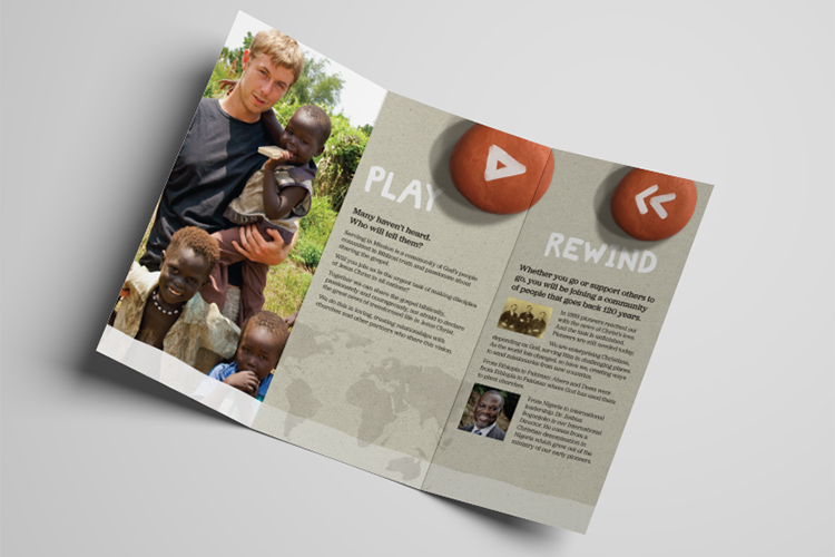
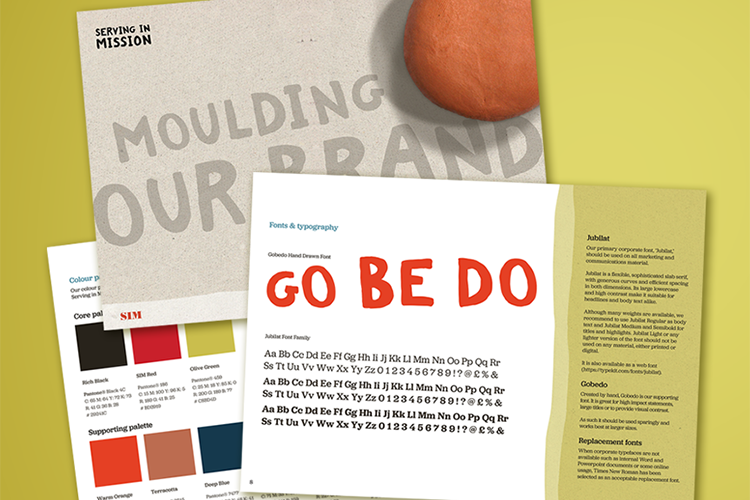
The Serving in Mission name style is complemented by a clay pebble to form the full logo. “We are clay – shaped by God to be his ambassadors in a world of opportunity.”
The visual identity carefully blends photography, fonts, colours and textures to give a multicultural feel. The clay asset also works separately from the name style as an illustrative device. We created a detailed set of brand guidelines to show how all of these elements combine. These help Serving in Mission to communicate the new brand consistently, without restricting creativity. These guidelines are used alongside the parent brand guidelines for the international SIM brand, and explain how the two brands can coexist.

Go, Pray, Give
To spread SIM’s message online, the IE Digital team developed a new multi-channel digital strategy, focused on exposing stories of transformation with on and offline calls to action around the active messaging of “Go,” “Pray,” and “Give”.
We designed and built a new Drupal website, provided staff training and delivered a suite of on and offline templates and graphical assets for ongoing fundraising, volunteer recruitment and comms.
Six years on, the brand is still serving the charity’s mission well, and income has held steady despite the challenging environment for charities. IE continues to work with Serving in Mission to host and support the website.
I have very much enjoyed working with the IE team and particularly appreciated your help and support through the challenges of the project.
Allie Schwaar
Communications Manager, Serving in Mission


