
Charity, Health, IE News
Going for gold – awards shortlisting hat-trick
Amidst all the Covid and Brexit doom-scrolling, the IE team is thrilled to be able to announce that our 2020 rebrands for Resuscitation Council UK and Clergy Support Trust have been shortlisted for three prestigious pan-European branding awards. We’ve bagged two nominations for ‘Best Visual Identity’ (one in the Charity sector and a second in the Health sector), and another cross-sector shortlisting for ‘Best Naming Strategy’.

The Transform Awards reward and inspire those who, like IE Brand, are truly passionate about the transformative power of brand strategy, creativity, and design.
Only the truly deserving can take home a Transform butterfly, as their robust scoring system ensures you have to meet a certain standard to win a commendation, Bronze, Silver or Gold. If no-one meets that standard, no-one wins Gold.
With robust research, stunning new visuals and impressive impact measures in hand, we felt quietly confident that Resuscitation Council UK and Clergy Support Trust could be in with a shot at awards glory. The Transform Awards judges clearly agreed, giving us three shots at the big prize, from three award entries.
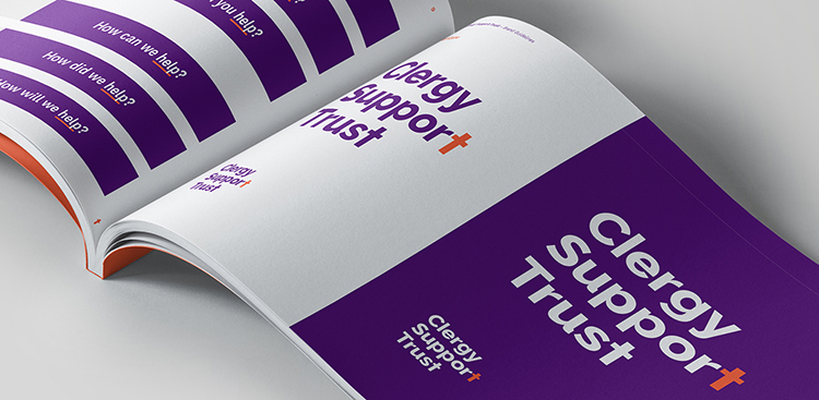
Renaming ‘Sons and Friends of the Clergy’
Clergy Support Trust helps Anglican clergy and their families in times of need. Under their new strategy, they aimed to double the number of clergy families they support over the next three to four years. This required them to become more visible and accessible to the people who need them.
They knew that the name ‘Sons and Friends of the Clergy’ was leading to certain misperceptions, so they asked IE Brand to help them to reposition, rebrand and find a new name, following a thorough period of stakeholder research. Clergy have commented that the new name is relevant, inclusive and ‘says what you do’. It was particularly well received by female clergy, who remarked that they would never have approached ‘Sons & Friends of the Clergy’ for help, whereas ‘Clergy Support Trust’ sounded like a charity that could help them.
The new visual identity conveys a brand that’s helpful, empathetic and passionate. The look is modern, confident, inclusive and colourful. In the first year since the rebrand, Clergy Support Trust have already increased the number of beneficiaries they have helped by 66% (906 in 2019 up from 547 in 2018).
Our work is shortlisted for ‘Best Visual Identity from a Charity, NGO or Not-For-Profit’, which covers all visual aspects of a rebrand, from logo to typeface, in the sector. Past winners in this category include NSPCC, The League Against Cruel Sports, and Race Against Dementia.
And while it’s always gratifying to be awarded for our design work, we are particularly thrilled to be recognised for our strategy work, in the ‘Best Naming Strategy’ category. This award honours innovation in naming, both for the most appropriate new name and for demonstrating a clear and well thought through naming strategy. It’s also contested across all sectors, putting us in the running alongside any European brand, from radio stations and airlines, to financial services and fast-moving consumer goods (FMCG).
You can follow IE's four step brand process and see the final, high impact outputs – including a new website designed and built by IE – in our Clergy Support Trust rebrand case study.
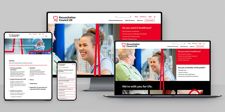
A more public-facing brand for Resuscitation Council UK
Resuscitation Council UK (RCUK) were already well-respected in clinical circles. However, they had ambitions to become more public-facing, in order to increase awareness of cardiac arrest and improve survival rates outside of hospital, by educating the public on what to do in an emergency. IE Brand was appointed to create a new brand and visual identity to help the healthcare charity adopt a louder voice on the national stage.
The new visual identity incorporates clinically accurate ECG patterns, which animate on digital platforms. This theme runs through into the new logo, which is based around a heart and line motif and an elegant, modern typeface. Read the full Resuscitation Council UK rebrand case study and take a look at their new website – also designed and built by IE.
It’s now in with a shot of being named ‘Best Visual Identity from the Healthcare and Pharmaceuticals Sector’ category at the Transform awards. IE Brand has previously won Gold in this category for our work on Sexwise.
The broadest shortlist ever
Despite the Coronavirus pandemic, the Transform Awards will be as hotly contested as ever in 2021. Andrew Thomas, publisher of Transform Magazine commented, “Despite the challenges we face, the Transform Awards 2021 still managed to grow. It is the broadest shortlist we’ve had, and we saw a fabulous range of agencies, companies and brands enter. I am so pleased to see IE Brand reach the shortlist, and in every category entered. Again, congratulations.”
All being well, the winners will be announced on 29 April at a COVID-safe Transform Awards dinner.
Despite the challenges we face, the Transform Awards 2021 still managed to grow. It is the broadest shortlist we’ve had, and we saw a fabulous range of agencies, companies and brands enter. I am so pleased to see IE Brand reach the shortlist, and in every category entered. Again, congratulations.
Andrew Thomas
Publisher, Transform Magazine