Creative
The art of collage: rebranding University of Reading Careers
Our Gold Transform Award-winning designer Pascaline tells us what inspired her to create 'The best visual identity in the education sector', and explains how to achieve a similar effect using collage techniques.
Just another careers service rebrand?
All brands want to be recognised and remembered. In the case of careers services within universities, their need to stand out is vital if they are to improve student employability outcomes. They can’t afford to be shy: universities are visually crowded.
The University of Reading needed a new visual identity that would support the idea of the careers service as a 'challenging friend' – gently intriguing and coaxing students to take an interest in life after graduation, while using short. snappy copy to give them a much needed kick-up-the-backside. This is where the idea of a ‘Jekyll & Hyde’ personality came into view. You can read more about the research and insight that led to this approach in our University Careers Services case study.
How do you visually express ‘Jekyll & Hyde’?
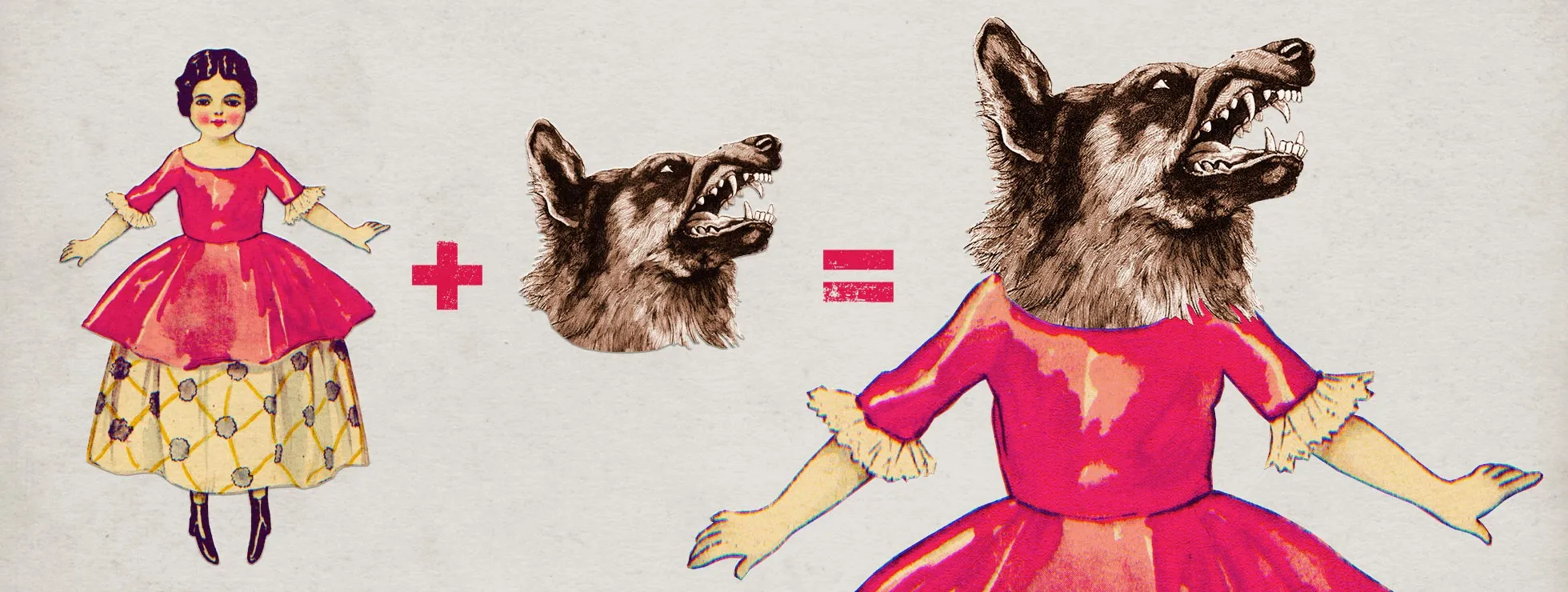
My inspiration came directly from the novel by Robert Louis Stevenson. In the late 19th century, illustrations were essentially etched in order to be mass produced. There are plenty of copyright-free prints available from that time, which gave us a fantastic collection of images to work with. We began by building up a visual library from anything we could use from these sources. Old printed illustrations are a great alternative to photography and illustration and they are much less common, giving the work a unique feel.
We wanted to translate the idea of a two-faced character into the visuals, and the technique of collage seemed like a perfect fit. I’ve always loved this style and had made some collages in the past, using cutouts from old books and magazines found at car boot sales. This time we kept the process digital to give us more flexibility, but retained that hand-made look. The results are sometimes funny, sometimes scary but always surprising. This is why the technique is so exciting.
Collect, cut, join, stick
Making collages is very simple, but sourcing the right images in the first place can be time consuming. We needed to find the right images that could be put together seamlessly, before cutting out the parts we wanted to join and putting them together. For example, if I want to create a character from three animals, I need to find three suitable images I can piece together. This can be a challenge, because our resources are quite limited. Animals can be drawn in a variety of different angles, perspective or be partially obscured by other elements of the design. Or we might simply discover, through trial and error, that it’s impossible to stick a lion’s head on a snake! So I had to keep experimenting until I found the right fit.
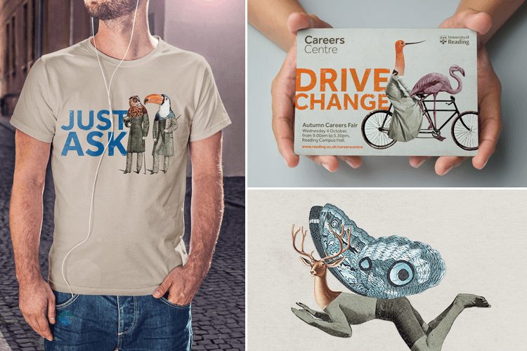
One of the hardest collages to create was a flamingo riding a bicycle. I knew I needed an animal with long legs, but they also needed to look like they were really using the pedals. So I kept the idea in my mind while I worked on other collages, until I found the perfect illustration. It might never have happened, but I was lucky to find the images that worked together. The gentlemen-birds were the most entertaining to make. Anthropomorphism has always been popular, and birds just seem to work really well. It’s easy to imagine them drinking tea and talking about the industrial revolution. They’re also very simple and looks really effective.
Putting it together
We decided on very short and punchy straplines that really made the illustrations pop. We followed the university's brand guidelines 100% in terms of layout, fonts and colours, but to give the page a bit more depth we added a bit of texture on the font and background, while keeping the rest of the composition as simple as possible. We wanted the illustration and strapline to do the job of catching students’ attention, and believed that the rest could be told in the copy.
An award-winning service
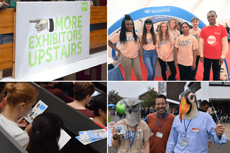
Although we were very proud of the results, we hadn't expected the visual identity to become so popular. When the University of Reading Careers launched the campaign during Freshers' Week 2016, they created t-shirts, mugs, fridge magnets and goody bags to give away to students. They even had people wearing animal masks around the uni as part of the launch. It caused a real stir on campus and – most importantly – achieved what it set out to do. Student attendance at careers workshops has rocketed and social media engagement is flourishing.
Winning Gold at the Transform Awards 2017 for 'Best visual identity in the education sector', and being Highly Commended for 'Best use of a visual property' was simply the cherry on the cake.
Our judges praised the strong visuals, creative approach and impressive results coupled with a harmony between graphical and textual elements.
Transform Awards Europe
2017
